🌈 Winsor & Newton Cotman Watercolor Color Wheel
- Coloring Rainbows
- Feb 17
- 3 min read

Making ART!! Having FUN!!

🌈 Create a Watercolor Color Wheel Using Winsor & Newton Cotman Watercolors
Building a color wheel is one of the most effective ways to learn how pigments behave in real watercolor mixing. When you limit yourself to just three primary colors, you quickly see how secondary and tertiary colors emerge—and how different paint formulations influence the final results.
In this guide, we’ll use Winsor & Newton Cotman Watercolors, a student-grade line known for its affordability, consistency, and surprisingly strong performance for learning color theory.
Materials You'll Need
Watercolor paper (cold press, 140lb or 300lb)
Pencil and eraser
Compass or circular template (see below)
Ruler
Round Watercolor Paintbrush
Water container
Mixing palette
Paper towel
Three primary colors (suggestions below)
Optional:
Waterproof pen for labeling
Color swatch journal
Cotman 3-Primary Color Wheel Palette
For this exercise, we’ll use a simple traditional-style primary set:
Lemon Yellow Hue
Alizarin Crimson Hue
Ultramarine
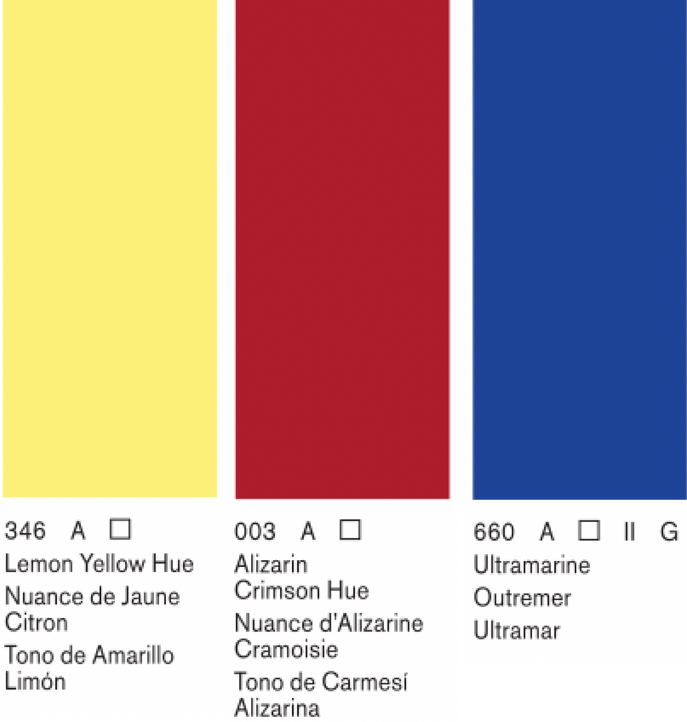
Unlike professional single-pigment sets, Cotman “Hue” colors are often blends of multiple pigments designed to mimic traditional hues. Their mixing behavior is less predictable than professional paints. This means:
Oranges may appear slightly muted or earthy
Violets often lean soft and subdued
Greens can shift toward olive or natural tones
🟡 Lemon Yellow Hue
Bright, student-grade yellow
Hue version contains multiple pigments
Good for basic mixing
Slightly less clean than professional PY3 alternatives
🔴 Alizarin Crimson Hue
Traditional-looking cool red
Hue version may shift differently than genuine PR83 replacements
Useful for soft violets and muted oranges
Less predictable than single-pigment quinacridones
🔵 Ultramarine (PB29)
Reliable warm blue
Slight granulation depending on paper
Good mixing behavior
Produces natural greens and violets
Create a Color Wheel
Here are the instructions for how to create the color wheel:
Step 1: Draw the Color Wheel
Draw a circle and divide it into 12 equal sections for these colors:
3 primary colors
3 secondary colors
6 tertiary colors

Step 2: Paint the Primary Colors
Place your three primaries evenly around the wheel.
Yellow at the top (12 o'clock)
Red on the lower right (4 o'clock)
Blue on the lower left (8 o'clock)
Let the paint dry before continuing.
Step 3: Mix the Secondary Colors
Mix equal parts of neighboring primaries:
Yellow + Red = Orange
Red + Blue = Violet
Blue + Yellow = Green
Place each secondary color between its parent primaries.
Step 4: Create the Tertiary Colors
Fill the remaining six sections by mixing each primary with its neighboring secondary:
Yellow + Orange
Red + Orange
Red + Violet
Blue + Violet
Blue + Green
Yellow + Green
What You Learn From This Exercise
By building a color wheel with these paints, you begin to understand:
How student-grade paints actually behave in practice
Why hue mixtures can affect color clarity
How limited palettes still create full color systems
How mixing results differ from professional pigments
Most importantly, you see that color theory is not abstract—it is shaped entirely by the physical behavior of real watercolor pigments.
🌈 Final Thoughts
Creating a color wheel with Winsor & Newton Cotman Watercolors is a practical, accessible way to explore color theory. While the results may be less vivid than professional pigment sets, the experience is extremely valuable:
It teaches real-world mixing expectations
It reveals the impact of pigment quality
It builds confidence with limited palettes
It strengthens foundational color understanding
Most importantly, it shows that color theory works at every level—from student paints to professional artist-grade watercolors.

Thank you for join us at Coloring Rainbows!
Find us on Substack at https://coloringrainbows.substack.com
Find us on Youtube at https://www.youtube.com/@ColoringRainbows


Comments