🌈 Use a Color Wheel
- Coloring Rainbows
- Feb 9
- 4 min read

Making ART!! Having FUN!!

🌈 Understand Color Relationships Using a Color Wheel
Color plays a powerful role in nearly every creative endeavor. It has the ability to influence mood, establish atmosphere, create visual movement, highlight contrast, and evoke emotion. Whether you’re painting, illustrating, designing, decorating, or developing a visual brand, understanding how colors interact can significantly enhance your creative decisions.
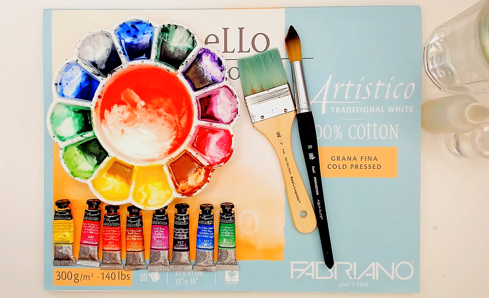
At the center of this understanding is the color wheel—a fundamental tool for learning the language of color. The color wheel is a circular diagram that arranges colors according to their relationships with one another. Rather than existing as separate elements, colors are presented as part of a connected system where they blend, contrast, complement, and transform.
Think of the color wheel as a roadmap for color. It reveals how colors are created, how they relate to neighboring and opposing hues, and how different combinations can produce harmony, balance, excitement, or drama. By understanding the color wheel, artists and designers gain the knowledge needed to make confident, intentional color choices and create more visually compelling work.

The Basic Structure of the Color Wheel
The color wheel is usually arranged in a circular sequence that moves gradually through the spectrum of color. This structure helps visualize how colors transition into one another naturally. The wheel is typically built from three main groups of colors:
Primary colors
Secondary colors
Tertiary colors
Together, these categories form the foundation of traditional color theory.

Primary Colors: The Foundation of the Wheel
Primary colors are considered the base colors because they cannot be created by mixing other colors together. In traditional painting and pigment-based color theory, the primary colors are:
Yellow
Red
Blue
These three colors form the foundation from which all other colors on the wheel are created.
By combining different amounts of primary colors, artists can mix a wide range of additional hues. Primary colors often feel bold, pure, and visually strong because they exist at the core of the color system itself.

Secondary Colors: Created Through Mixing
Secondary colors are formed by mixing two primary colors together. The secondary colors are:
Orange (red + yellow)
Green (yellow + blue)
Violet or purple (blue + red)
On the color wheel, secondary colors are placed between the two primary colors used to create them. This arrangement visually demonstrates the blending relationship between neighboring hues. Secondary colors often introduce more complexity and variety into a palette while still maintaining strong visual balance.
Tertiary Colors: Transitional Hues
Tertiary colors are created by mixing a primary color with a neighboring secondary color. Examples include:
Red-orange
Yellow-orange
Yellow-green
Blue-green
Blue-violet
Red-violet
These colors fill the spaces between primary and secondary colors on the wheel, creating smoother transitions throughout the spectrum. Tertiary colors often feel nuanced, expressive, and dynamic because they contain subtle shifts in temperature and intensity. The addition of tertiary colors helps transform the wheel from a simple chart into a flowing system of interconnected relationships.
Why the Circular Shape Matters
The circular arrangement of the color wheel is important because it visually demonstrates continuity. Instead of showing colors as separate categories, the wheel reveals how hues gradually transition into one another. This helps you understand:
Color blending
Color progression
Temperature shifts
Harmony and contrast
Visual balance
The wheel allows creators to see relationships instantly, making it easier to build palettes intentionally rather than relying only on instinct. Over time, you will begin to internalize these relationships naturally through repeated observation and experimentation.
The History of the Color Wheel
The color wheel has evolved over centuries as artists, scientists, and philosophers studied color and human perception. Early versions were developed to help painters understand pigment mixing and harmonious combinations.
Over time, color theory expanded into:
Fine art
Printing
Photography
Graphic design
Fashion
Interior design
Digital media
Modern color systems continue to build upon these foundational ideas while adapting them to new technologies and creative tools. Even in today’s digital world, the traditional color wheel remains one of the most widely used educational tools for understanding color relationships.
Why the Color Wheel Matters for Artists
For artists and creators, the color wheel is both a learning tool and a practical guide. It helps with:
Mixing colors more accurately
Building cohesive palettes
Understanding contrast
Creating mood and atmosphere
Solving visual problems
Developing intentional compositions
Whether working with:
Watercolor
Acrylic paint
Colored pencils
Pastels
Graphic design software
Digital illustration tools
…the principles of the color wheel continue to apply. Understanding color relationships enables you to make decisions with greater confidence rather than relying entirely on guesswork.
The Color Wheel as a Creative Tool
While the color wheel provides structure, it is not meant to limit creativity. Instead, it gives you a foundation for experimentation. Some creators follow traditional harmony rules closely, while others intentionally break them to create tension, surprise, or emotional impact. The more familiar you become with color relationships, the more freedom you gain to use color intuitively and expressively.
At Coloring Rainbows, color exploration is viewed as part of a mindful creative process. The color wheel is not only a technical chart—it is a visual language that helps you connect emotion, movement, and imagination through color.
🌈 Closing Thought
The color wheel is a visual aid that shows you how colors interact, influence one another, and shape emotional experience. By studying the color wheel, you may gain a deeper understanding of harmony, contrast, balance, and expression.

Thank you for join us at Coloring Rainbows!
Find us on Substack at https://coloringrainbows.substack.com
Find us on Youtube at https://www.youtube.com/@ColoringRainbows


Comments