🌈 Study Color Relationships
- Coloring Rainbows
- Feb 19
- 2 min read

Making ART!! Having FUN!!

🌈 Understanding Color Relationships
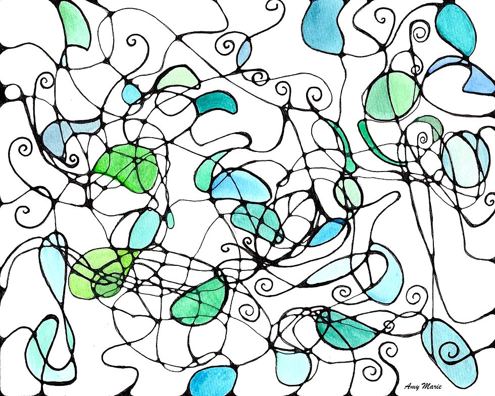
One of the most important functions of the color wheel is to help you understand color relationships and harmony. Because colors are arranged according to their position and connection to one another, the color wheel makes it easier to recognize combinations that naturally feel balanced, expressive, or visually pleasing. Different color relationships create different moods, levels of contrast, and emotional effects within a composition. Learning these relationships will give you more confidence when choosing and mixing colors.

Analogous Colors: Soft and Harmonious
Analogous colors are colors positioned next to each other on the wheel. Examples include:
Blue, blue-green, and green
Yellow, yellow-orange, and orange
Because these colors are closely related, they create:
Smooth transitions
Gentle movement
Visual harmony
Calm, cohesive palettes
Analogous color schemes are often used to create peaceful, atmospheric, or unified artwork. They tend to feel natural because similar hues blend together easily.
Complementary Colors: Contrast and Energy
Complementary colors are located opposite each other on the color wheel. Examples include:
Blue and orange
Red and green
Yellow and violet
These pairings create strong contrast because warm and cool tones interact directly against one another. Complementary colors often produce:
Visual energy
Bold contrast
Increased vibrancy
Strong focal points
You may use complementary relationships to create emphasis and excitement within a composition. When balanced carefully, complementary colors can make paintings feel dynamic and visually alive.
Triadic and Split-Complementary Schemes
The color wheel also helps artists build more advanced color relationships. Triadic color schemes use three evenly spaced colors around the wheel, such as:
Red, yellow, and blue
Orange, green, and violet
These palettes often feel balanced, playful, and vibrant. Split-complementary schemes combine one color with the two colors adjacent to its complement. This approach maintains contrast while creating a softer and more flexible harmony. The color wheel makes these relationships easier to visualize and experiment with.
Warm Colors and Cool Colors
Another important feature of the color wheel is its division between warm and cool colors. Understanding warm and cool relationships allows creators to shape the emotional tone of a piece more intentionally.
Warm Colors
Warm colors tend to visually advance toward the viewer, making them feel active and attention-grabbing. They are often used to create energy, vibrancy, and emotional intensity. Warm colors include Red, Orange, and Yellow. These colors are often associated with:
Warmth
Sunlight
Energy
Passion
Movement
Excitement

Cool Colors
Cool colors tend to visually recede, creating feelings of space and softness. You may use cool palettes to create peaceful atmospheres or emotional subtlety. Cool colors include Blue, Green and Violet. These colors are commonly associated with:
Calmness
Water
Distance
Quietness
Reflection
Tranquility

🌈 Closing Thought
The color wheel is a tool for understanding how colors interact emotionally and visually. By exploring relationships such as analogous, complementary, triadic, and warm versus cool palettes, artists develop a deeper awareness of harmony, contrast, balance, and expression. Over time, these relationships become less about memorizing rules and more about learning to trust your eye, intuition, and creative voice.

Thank you for join us at Coloring Rainbows!
Find us on Substack at https://coloringrainbows.substack.com
Find us on Youtube at https://www.youtube.com/@ColoringRainbows


Comments