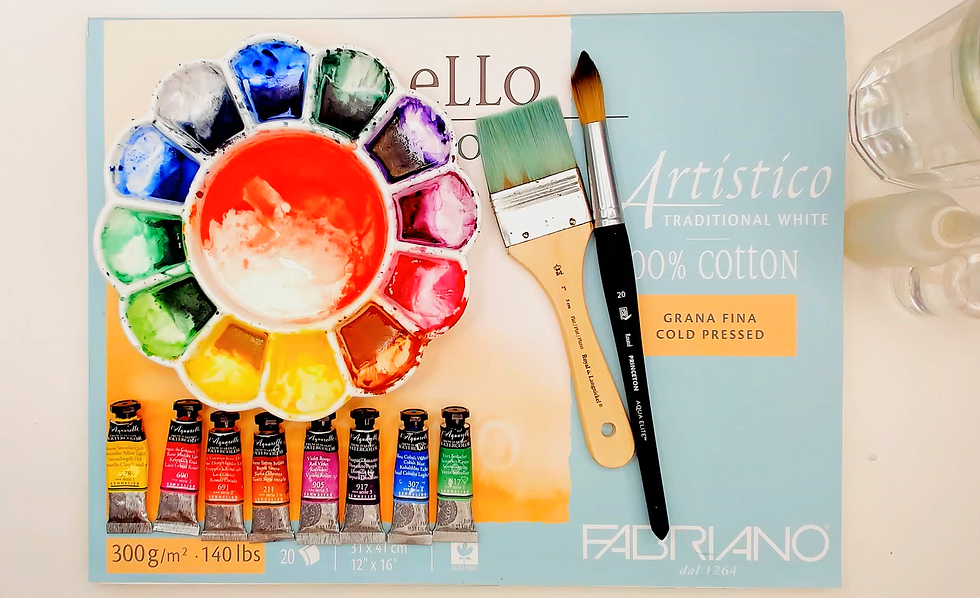
🌈 How Colors Behave When Mixed
- Coloring Rainbows
- Feb 21
- 4 min read

Making ART!! Having FUN!!

🌈 How Colors Behave When Mixed
One of the most exciting aspects of painting is discovering new colors through mixing. Yet many beginners are surprised when their mixtures don't produce the bright, vibrant colors they expected. A yellow and a blue may create a beautiful green, while another yellow and blue produce a dull olive color. Understanding why this happens is an important step toward mastering color.
Color mixing is not simply about combining paints—it is about understanding how pigments interact. The more familiar you become with pigment behavior, color temperature, and pigment composition, the more predictable your mixtures will become.
The Basics of Color Mixing
Traditional color theory teaches that the three primary colors are:
Red
Yellow
Blue
When mixed together, they create secondary colors:
Yellow + Blue = Green
Yellow + Red = Orange
Red + Blue = Violet
While this is a useful starting point, real-world paint mixing is often more complex because paints contain specific pigments that each have unique characteristics.
Not All Blues Are the Same
Two paints may share the same color name yet behave differently when mixed. For example:
Ultramarine Blue tends to lean toward violet.
Phthalo Blue often leans toward green.
When mixed with the same yellow, these blues can produce noticeably different greens.
This is why artists often pay attention to color temperature and pigment composition rather than relying solely on color names.
Understanding Color Bias
Most pigments contain a subtle bias toward a neighboring color on the color wheel. For example:
Warm Yellow
A warm yellow often leans toward orange. Examples include:
Cadmium Yellow Medium
Indian Yellow
Cool Yellow
A cool yellow often leans toward green. Examples include:
Lemon Yellow
Hansa Yellow Light
The same concept applies to reds and blues. These biases influence the colors produced when paints are mixed.
Why Some Mixtures Are Bright
Bright mixtures usually occur when pigments share similar color tendencies. For example:
A cool yellow mixed with a cool blue often creates a vibrant green.
A warm red mixed with a warm yellow often produces a strong orange.
Because the pigments are moving in similar directions on the color wheel, the resulting color remains clear and intense.
Why Some Mixtures Become Muted
Many artists describe unwanted mixtures as muddy, but muted colors are not necessarily bad. Muted colors occur when a mixture contains pigments that pull in different directions on the color wheel. For example:
A warm blue mixed with a warm yellow may create a softer green.
Complementary colors can neutralize one another when combined.
These mixtures often produce:
Earth tones
Natural greens
Soft grays
Atmospheric colors
Many landscape and portrait painters intentionally use muted mixtures because they appear more natural than highly saturated colors.
The Role of Complementary Colors
Complementary colors sit opposite one another on the color wheel. Examples include:
Red and Green
Blue and Orange
Yellow and Violet
When mixed together, complementary colors reduce each other's intensity.
Depending on the proportions used, they may create:
Browns
Grays
Neutral tones
Deep shadows
Understanding complementary relationships allows artists to control color intensity more effectively.
Single-Pigment vs. Multi-Pigment Mixing
The pigments present in a paint have a major influence on mixing results.
Single-pigment paints often:
Produce cleaner mixtures
Offer greater predictability
Create brighter secondary colors
Multi-pigment paints can:
Produce more complex mixtures
Create natural-looking neutrals
Increase the likelihood of duller results when overmixed
Neither approach is inherently better. The key is understanding what pigments are already present before adding additional colors.
Transparency and Mixing
Transparency can also affect how colors appear when layered.
Transparent paints:
Allow light to pass through multiple layers
Create luminous glazing effects
Preserve color depth
Opaque paints:
Cover underlying layers
Produce more direct color statements
Can alter the appearance of colors beneath them
Two paints with similar hues may behave very differently depending on their transparency.
Create a Color Chart
One of the best ways to understand color behavior is through experimentation. Many artists create color-mixing charts that show:
Primary color combinations
Secondary color variations
Neutral mixtures
Complementary mixtures
These charts provide a valuable reference and often reveal surprising relationships between pigments. Over time, they become a personal guide to your palette.
Learning to Predict Mixtures
As you gain experience, you begin to recognize patterns. you learn:
Which pigments mix cleanly
Which colors create vibrant secondaries
Which combinations produce useful neutrals
How warm and cool pigments influence mixtures
This knowledge allows color mixing to become less about guesswork and more about intentional decision-making.
Color Mixing Is a Skill
Many beginners assume experienced artists instinctively know every mixture. In reality, color mixing is a learned skill developed through observation, experimentation, and practice. Each palette behaves differently, and every artist develops their own understanding of the pigments they use most often. The more time you spend mixing colors, the more predictable and enjoyable the process becomes.
🌈 Closing Thought
Colors do not simply combine—they interact. Every pigment brings its own characteristics, temperature, transparency, and mixing behavior. By understanding how colors influence one another, you gain greater control over harmony, contrast, intensity, and mood. Over time, successful color mixing becomes less about memorizing formulas and more about observing relationships, experimenting with pigments, and developing confidence in your creative choices.

Thank you for join us at Coloring Rainbows!
Find us on Substack at https://coloringrainbows.substack.com
Find us on Youtube at https://www.youtube.com/@ColoringRainbows


Comments