🌈 Explore Color Harmony
- Coloring Rainbows
- Feb 6
- 2 min read

Making ART!! Having FUN!!

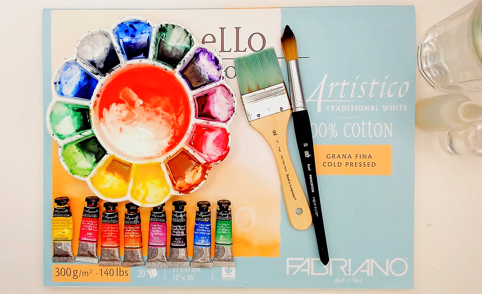
🌈 Exploring Color Harmony in Watercolor Painting
Color has the power to shape the entire feeling of a painting. Even simple compositions can feel calm, energetic, dramatic, or balanced depending on how colors interact with one another. In watercolor painting, understanding color harmony can help create artwork that feels more connected, expressive, and visually engaging.
At Coloring Rainbows, color is explored not only as a visual element, but as a creative language. The way colors blend, contrast, soften, or repeat across the page becomes part of the painting’s rhythm and atmosphere.
Color harmony refers to the relationship between colors that naturally work well together. Rather than competing for attention, harmonious colors create a sense of balance and flow throughout the artwork.
One of the simplest forms of harmony comes from using analogous colors—colors that sit next to each other on the color wheel, such as blue, blue-green, and green. These combinations often create soft, calming transitions and are especially beautiful in watercolor because of the way pigments naturally blend together.
Complementary colors create a different kind of energy. These are colors opposite one another on the color wheel, such as blue and orange or red and green. When used thoughtfully, complementary colors can create contrast, movement, and visual excitement while still maintaining balance.
At Coloring Rainbows, watercolor is often approached through experimentation and intuitive color exploration. Instead of rigidly following rules, artists are encouraged to observe how colors feel together on the page. Some combinations feel soft and atmospheric, while others feel vibrant and expressive.
Watercolor itself adds another layer to color harmony because pigments mix directly through water. Transparent layers allow colors to glow through one another, creating subtle shifts and unexpected transitions that make watercolor feel alive.
Limiting a palette can also strengthen color harmony. Many artists discover that using fewer colors often creates more cohesive paintings. A simple palette of three to six carefully chosen colors can produce a wide range of beautiful mixtures while maintaining visual unity.
Another important aspect of color harmony is repetition. Repeating certain colors throughout a painting helps guide the eye and creates a stronger sense of connection across the composition.
At Coloring Rainbows, color harmony is not treated as strict theory to memorize, but as a creative relationship to explore through observation and play. Over time, artists begin developing a personal sense of which colors resonate with their style, mood, and creative energy.
Watercolor becomes especially rewarding when color choices begin to feel intuitive rather than forced. The painting starts to flow naturally as colors support one another across the page. Whether working with bold vibrant palettes or soft muted washes, color harmony helps create paintings that feel more unified, expressive, and visually alive.

🌈 Closing Thought
When colors begin to support one another instead of compete, the painting starts to breathe with its own quiet rhythm.

Thank you for joining us at Coloring Rainbows!
Make ART!! Have FUN!!
Find us on Substack at https://coloringrainbows.substack.com
Find us on Youtube at https://www.youtube.com/@ColoringRainbows


Comments