🌈 Understanding Color Theory

Making ART!! Having FUN!!

🌈 Why Color Theory Matters
Color is one of the most powerful tools of visual communication. It shapes emotion, creates atmosphere, establishes movement, and influences how we experience a work of art. Although our responses to color often feel instinctive, there are visual principles that artists can study, understand, and use to make more intentional creative choices.
Color theory is the study of how colors interact, influence perception, and work together to communicate meaning and emotion. It helps artists understand not only how to mix colors, but also how to create harmony, establish contrast, guide the viewer’s attention, and strengthen the overall impact of a painting or composition.
Think of color as a visual language. The way colors blend, contrast, soften, repeat, or vibrate against one another becomes part of the artwork’s personality and emotional rhythm. Through painting and creative experimentation, you'll begin to understand how color choices influence mood, storytelling, and visual balance.
🌈 The Three Essential Properties of Color
At the foundation of color theory are three essential properties: hue, value, and saturation. Understanding these three elements will help you recognize how colors behave and how to use them more effectively in your artwork.
Hue refers to the color itself, such as red, blue, yellow, or green.
Value describes how light or dark a color appears. It helps artists create contrast, suggest depth, define shapes, and establish a focal point within a composition.
Saturation refers to the intensity or vividness of a color. Highly saturated colors appear bright and vibrant, while less saturated colors look softer, more muted, or subdued.
Together, these three properties influence how colors appear and interact within a painting. A highly saturated warm color may create energy and excitement, while a muted cool color may feel peaceful, atmospheric, or distant. Strong contrasts in value can create drama and depth, while gentle transitions can produce a softer, more harmonious effect. Once you begin to understand hue, value, and saturation, you'll have greater control over the way your artwork looks and feels.

🌈 Understanding the Color Wheel
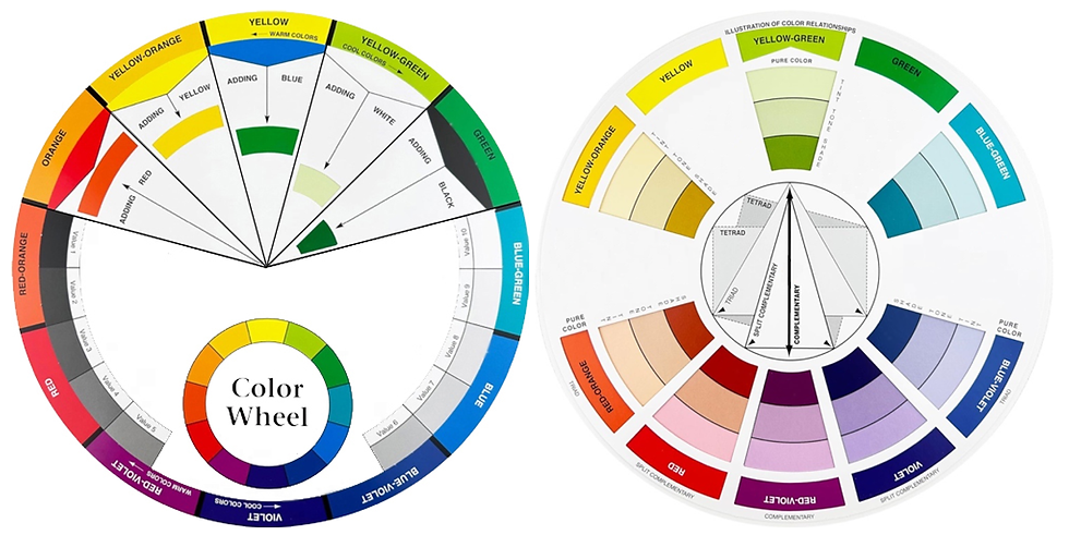
One of the most useful tools for learning color theory is the color wheel. This circular arrangement of colors provides a visual guide to understanding how colors relate to one another, transition between hues, and combine to create different effects. The traditional artist's color wheel organizes colors into three groups:
Primary Colors
Red, yellow, and blue are the traditional primary colors used in the familiar painter's color wheel. They serve as the foundation for exploring color mixing within this model.
Secondary Colors
Secondary colors are created by mixing two primary colors:
Red + Yellow = Orange
Yellow + Blue = Green
Blue + Red = Violet
Tertiary Colors
Tertiary colors are created by mixing a primary color with a neighboring secondary color. Examples include red-orange, yellow-orange, yellow-green, blue-green, blue-violet, and red-violet.
Together, these colors form the familiar color wheel and reveal patterns that help artists understand color harmony, contrast, and balance.
Image: This color wheel illustrates the primary, secondary, and tertiary colors.
🌈 Exploring Color Harmony
Once you understand how the color wheel works, you can begin exploring different color relationships. These combinations help you create palettes that feel balanced, expressive, and visually connected.
Complementary Colors
Complementary colors sit opposite one another on the color wheel, such as blue and orange or red and green. When placed together, they create strong contrast and can make each color appear more vibrant.
Analogous Colors
Analogous colors sit next to one another on the color wheel. Combinations such as yellow, yellow-green, and green often create a natural sense of harmony and unity.
Split-Complementary Colors
A split-complementary palette combines one color with the two colors positioned on either side of its complement. This creates contrast while offering more variety than a simple complementary pairing.
Triadic Color Harmony
A triadic palette uses three colors spaced approximately equally around the color wheel. These combinations can create lively, balanced compositions with plenty of visual interest.
Tetradic Color Harmony
A tetradic palette combines four colors arranged as two complementary pairs. This approach offers a wide range of possibilities for creating rich, colorful compositions.
Monochromatic Palettes
A monochromatic palette uses variations of a single hue by adjusting its value and saturation. This creates unity while allowing for subtle differences in depth, emphasis, and atmosphere.
Each color relationship offers something different. Some create bold, energetic contrasts, while others produce peaceful, cohesive, or understated effects.
🌈 Color, Emotion, and Artistic Expression
Color theory goes beyond the technical process of mixing paint. It also explores how colors influence our emotions, perceptions, and responses to the world around us. Depending on its context, a color may feel warm, energetic, peaceful, nostalgic, dramatic, or mysterious. A vibrant red might communicate excitement, while a muted red may feel softer and more understated. A deep blue can suggest mystery or contemplation, while a pale blue may evoke openness and tranquility.
Of course, color associations aren't universal rules. Cultural influences, personal experiences, lighting conditions, and surrounding colors all affect how we interpret what we see. As you experiment with different palettes, you'll discover how color can guide the viewer's attention, create a particular atmosphere, and help tell the story of your artwork.
🌈 Exploring Color Through Watercolor
Watercolor is an especially rewarding medium for studying color relationships because pigments interact naturally through water. Colors flow into one another, create delicate transitions, and produce unexpected mixtures that make each painting unique.
Transparent washes allow underlying colors to influence the layers above them, creating luminosity, depth, and subtle variations. A warm wash beside a cool wash can establish contrast, while neighboring hues that mingle on wet paper can create beautiful transitions.
You can also experiment with adding more water to lighten the appearance of a pigment, layering transparent washes to deepen color, and placing complementary colors next to one another to create visual energy.
Every experiment teaches you something about the behavior of your paints. As you become more familiar with your pigments, you'll begin to recognize which combinations produce vibrant colors, which create beautiful neutrals, and which work best for particular subjects. Over time, your color choices will become more confident and intuitive. Instead of simply following rules, you'll understand why certain combinations work and how to adapt them to suit your artistic vision.
🌈 Closing Thought
Learning color theory enables you to learn about the tools available to you so you can make more intentional choices, experiment with confidence, and discover new ways to express yourself through art. The more you understand color, the more possibilities you'll discover and the confident you'll become.

Thank you for join us at Coloring Rainbows!
Find us on Substack at https://coloringrainbows.substack.com
Find us on YouTube at https://www.youtube.com/@ColoringRainbows

Comments